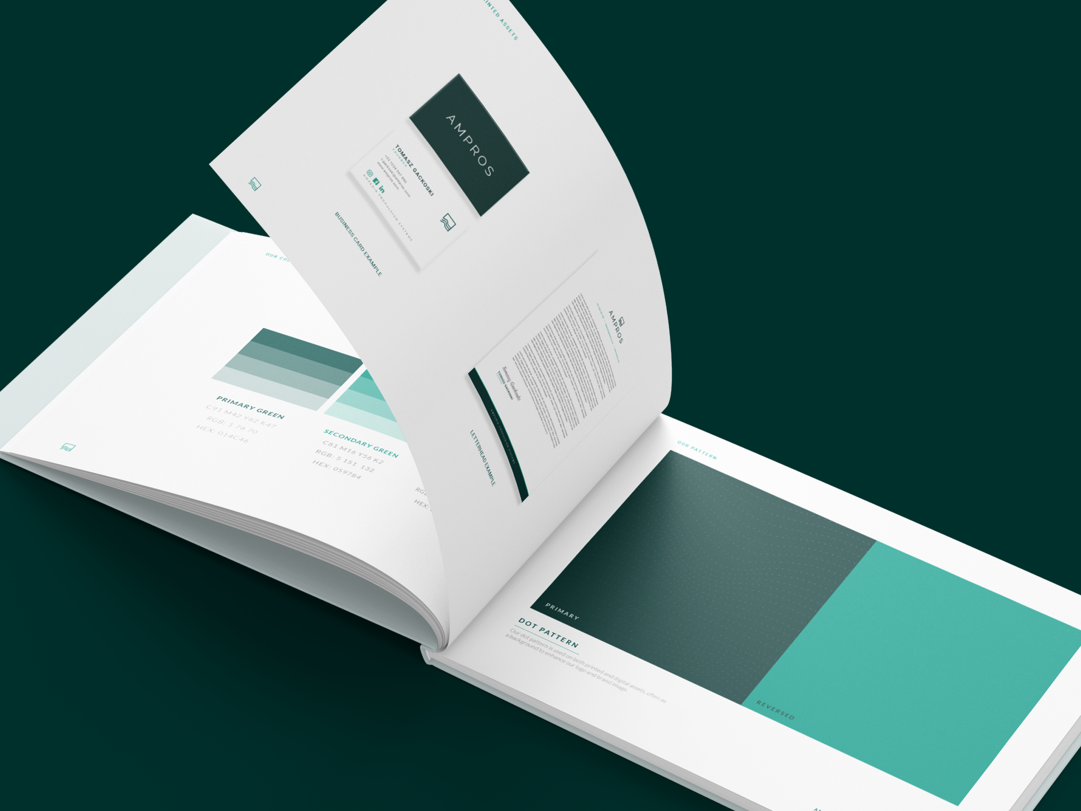
( Self initiated brief )
An up and coming Dundee based whiskey distillery is in need of an authentic brand style plus labelling concepts.
An up and coming Dundee based whiskey distillery is in need of an authentic brand style plus labelling concepts.
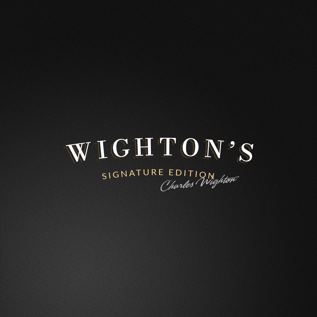
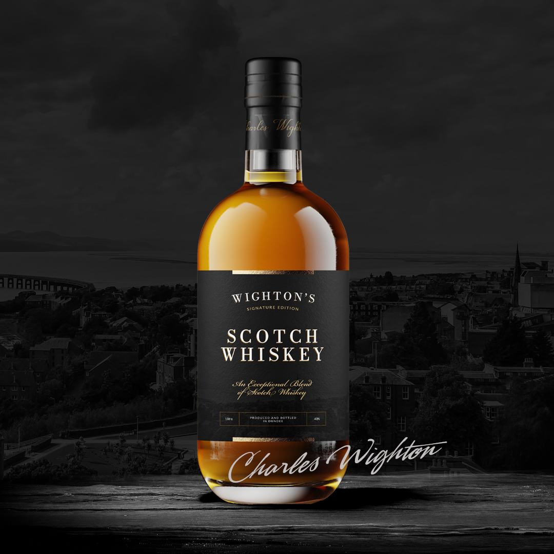
To start, I created a typographic arched logo, paying attention to leading between letters. I proceeded to duplicate and offset the logo in order to create a fine offset bronze outline that give the logo a stand out 3D impression upon the labels.
I wanted to give the logo and labels an extra sense of luxury and heritage, proceeding with the "signature edition" to achieve this.
After many developing rounds and experimenting with font and balances, I was happy to move on and begin creating the flat label.
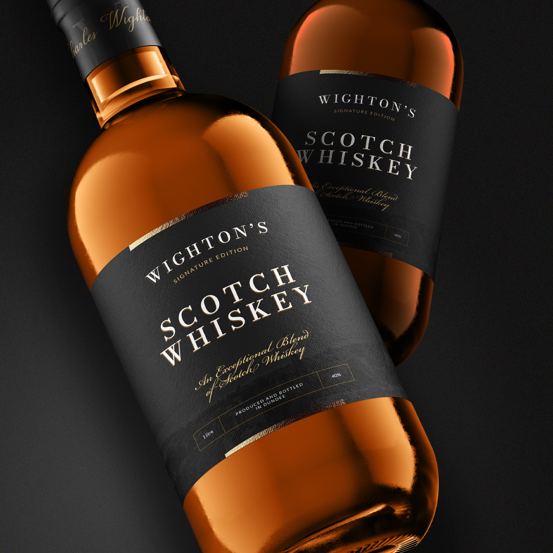
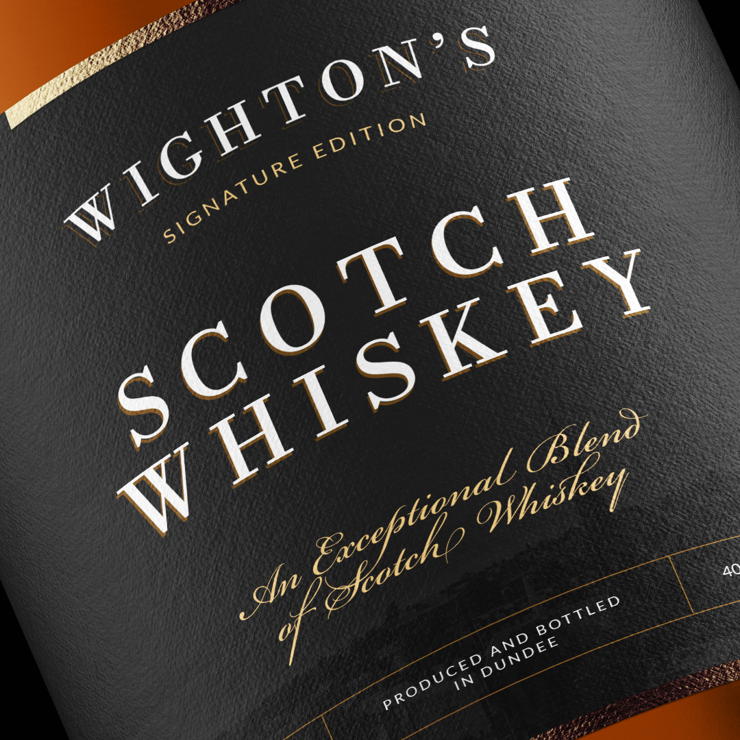
A simple photo of the Dundee skyline was sourced for the label background to add the sense of history. Again I experimented with various script and sans-serif fonts to compliment the logo which would sit prominently above the whiskey title.
Simple shapes and type were set for "Produced and bottled in Dundee" along with the alcohol percentage and volume of the bottle.
A subtle logomarks and details were added to the cap seal including "Charles Wighton" in a matching script font.
Finally, I imagine areas of the label to be gold foil printed to achieve that finishing, exceptional visual touch.
"An exceptional Blend of Scotch Whiskey"
- Charles Wighton