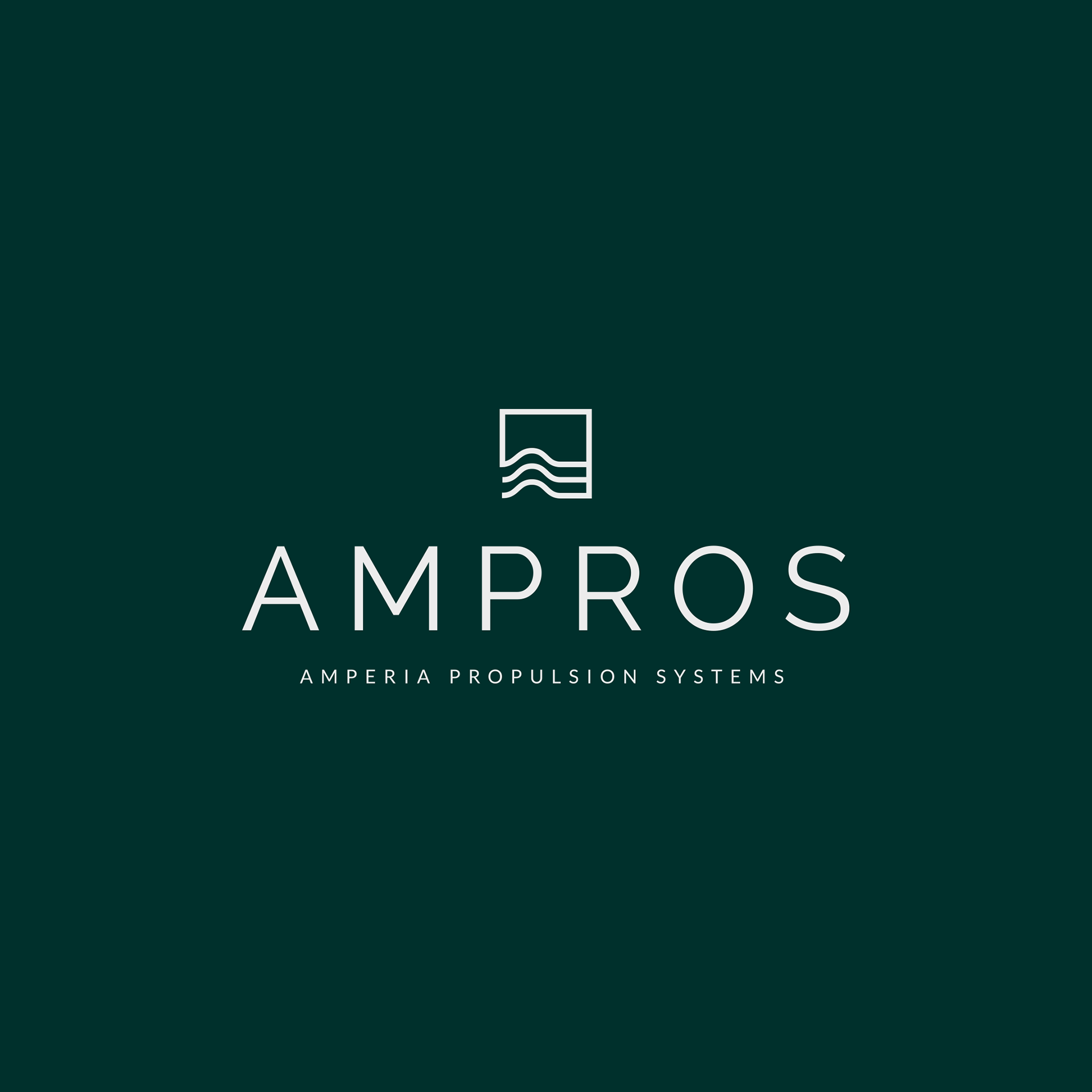
Ampros, An advanced electric propulsion company based out of Warsaw, Poland was in need of a fresh start. An identity was needed to reinforce the electrical concept of yacht propulsion moving forward. A visual brand that could continue to be developed across both print and digital platforms as the company grows.


THE SOLUTION
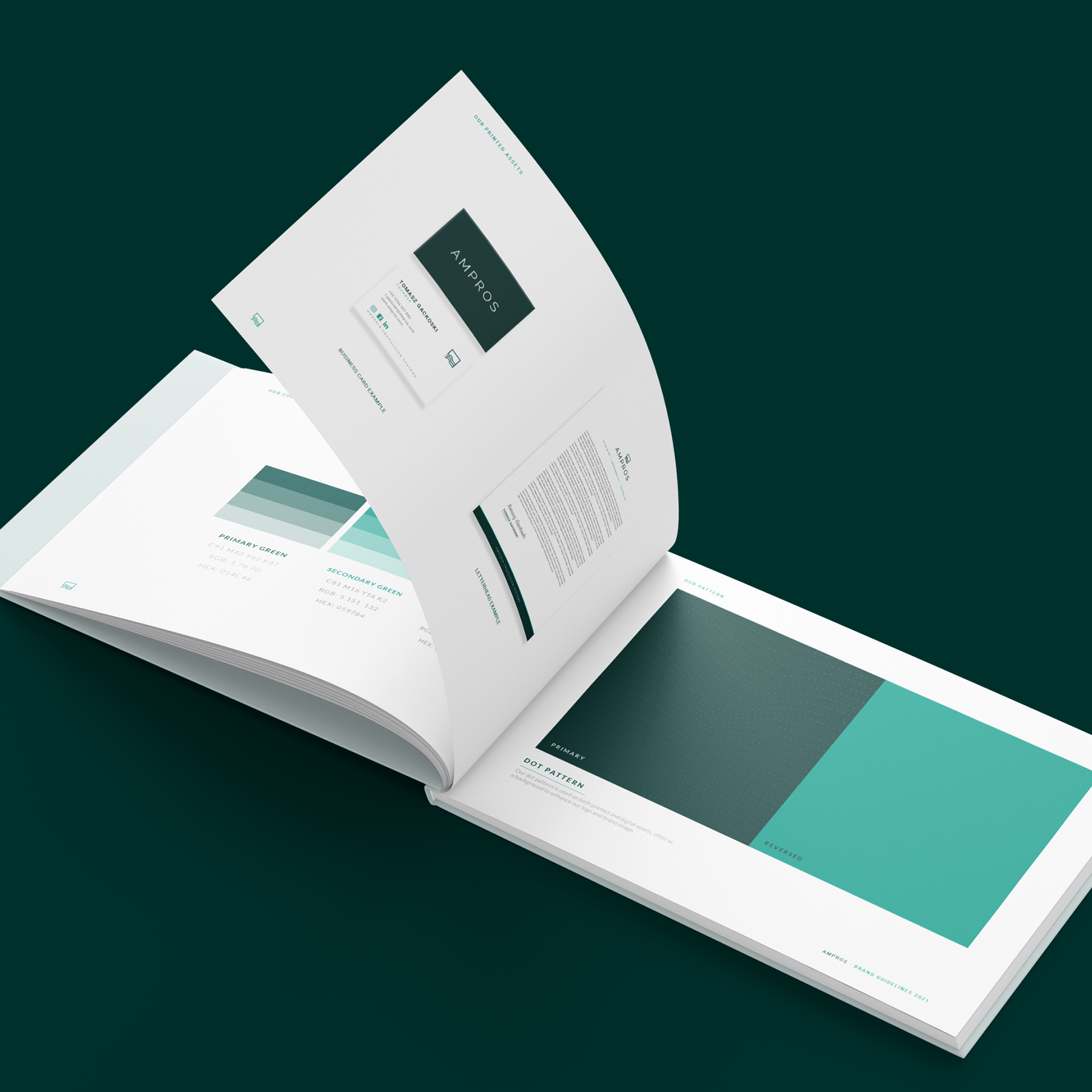
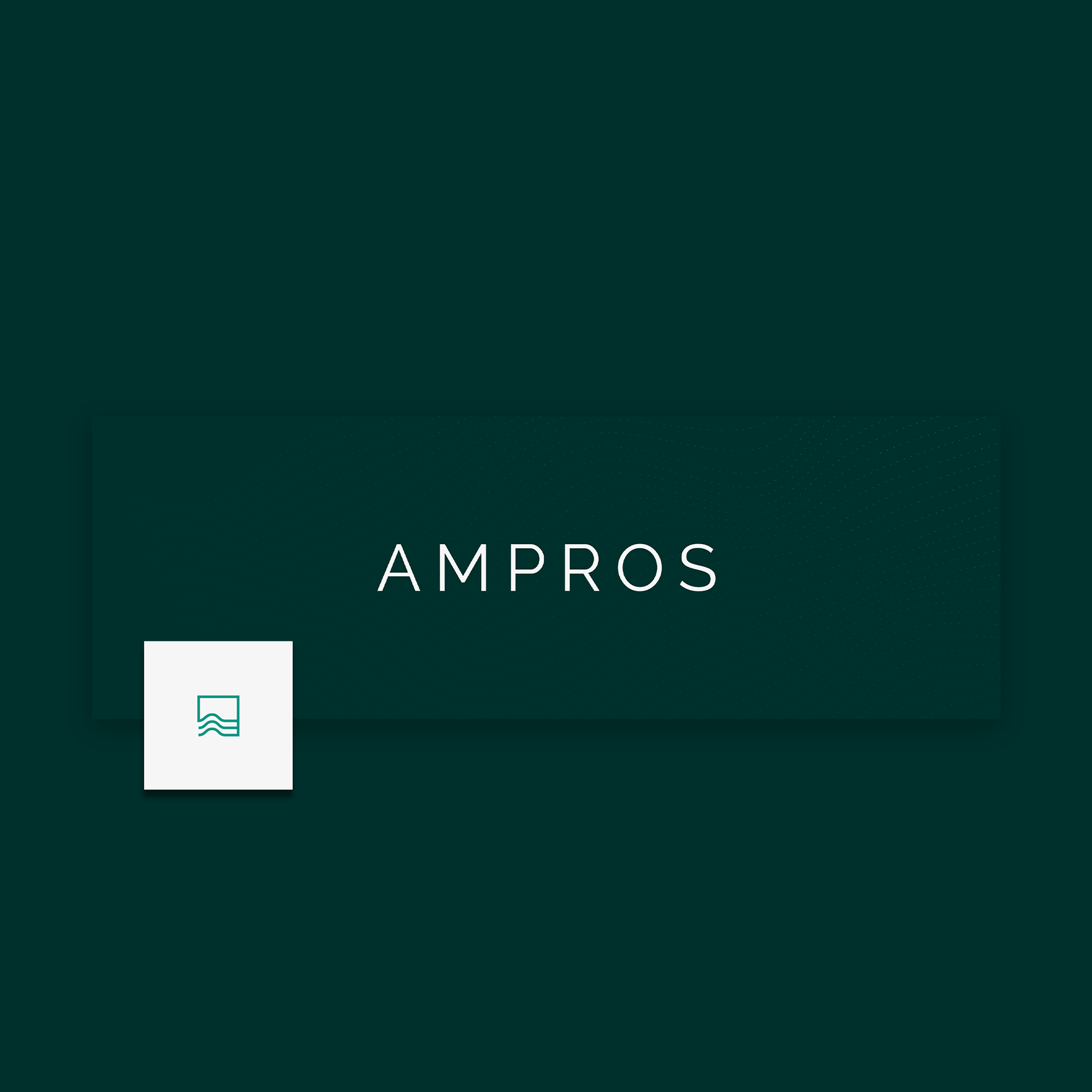
The project manager and I experimented with curves and rounded shapes to try and emphasis the waves generated by the electric propellors of Ampros. Along with a full logo lock up, we were keen to develop a stand alone mark that could identify Ampros, without any accompanying text. Once we had a logo solution were able to apply this to other items including company stationary and digital assets. A subtle dotted wave pattern was also created that would serve as a background across much of the brand assets.
Raleway was the chosen typeface for Ampros, paired with a colour palette focusing on oceanic greens and soft greys.
Being a newly branded company, a brand guidelines document was create to ensure consistency across the Ampros brand, in both print and digital outputs.
DELIVERABLES
Logo Design
Branded Stationary
Social Media Assets
Email Signaure
Brand Pattern
Brand Guidelines